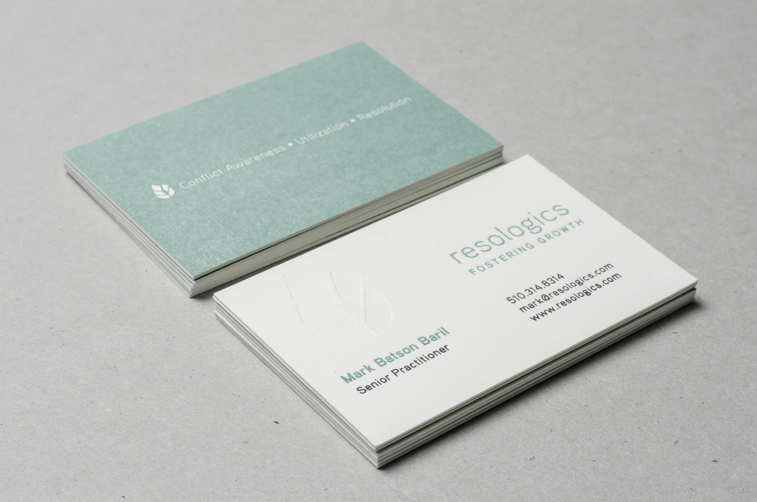
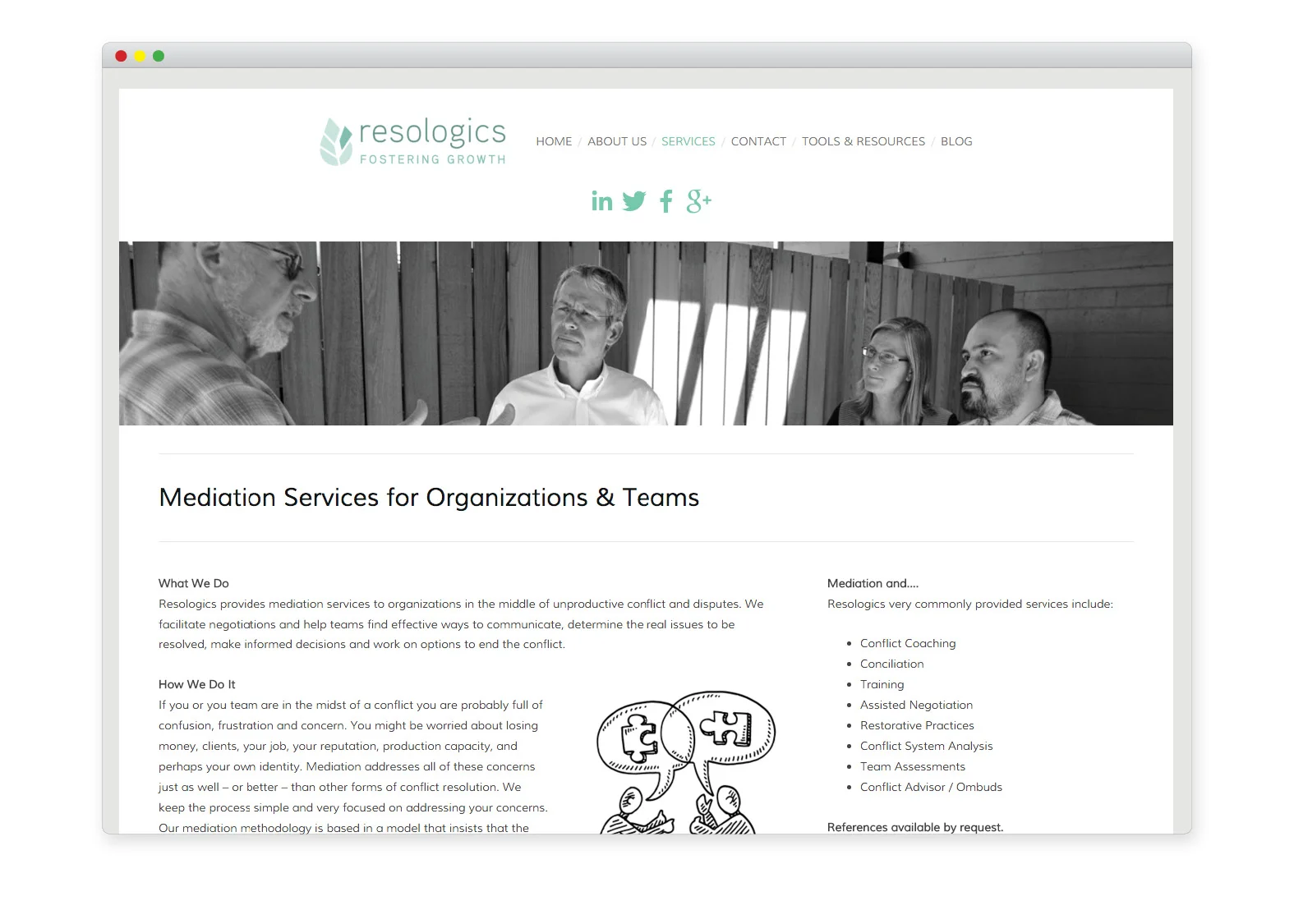
Resologics
Branding project for conflict resolution specialist who focuses on growth potential in start-up organizations. Logo, letterhead, and style guide that represents the uniqueness of the Resologics approach to conflict resolution. The a custom icon shape that represents the idea of "wholeness" and "completeness" in an organizational setting. Also created icons for several web tools. A style guide was provided to help continue developing a cohesive look across material.
Client: Resologics (Mark Baril)
Role: Creative Direction, Graphic Design, Photography
Collaborators: Mary Admasian, Craig Higdon, Keegan Meegan & Co.